Many classes have shortcut names used when creating (instantiating) a class with a
configuration object. The shortcut name is referred to as an alias (or xtype if the
class extends Ext.Component). The alias/xtype is listed next to the class name of
applicable classes for quick reference.
Framework classes or their members may be specified as private or protected. Else,
the class / member is public. Public, protected, and private are access
descriptors used to convey how and when the class or class member should be used.
Public classes and class members are available for use by any other class or application code and may be relied upon as a stable and persistent within major product versions. Public classes and members may safely be extended via a subclass.
Protected class members are stable public members intended to be used by the
owning class or its subclasses. Protected members may safely be extended via a subclass.
Private classes and class members are used internally by the framework and are not intended to be used by application developers. Private classes and members may change or be omitted from the framework at any time without notice and should not be relied upon in application logic.
static label next to the
method name. *See Static below.Below is an example class member that we can disect to show the syntax of a class member (the lookupComponent method as viewed from the Ext.button.Button class in this case).
Let's look at each part of the member row:
lookupComponent in this example)( item ) in this example)Ext.Component in this case). This may be omitted for methods that do not
return anything other than undefined or may display as multiple possible values
separated by a forward slash / signifying that what is returned may depend on the
results of the method call (i.e. a method may return a Component if a get method calls is
successful or false if unsuccessful which would be displayed as
Ext.Component/Boolean).PROTECTED in
this example - see the Flags section below)Ext.container.Container in this example). The source
class will be displayed as a blue link if the member originates from the current class
and gray if it is inherited from an ancestor or mixed-in class.view source in the example)item : Object in the example).undefined a "Returns" section
will note the type of class or object returned and a description (Ext.Component in the
example)Available since 3.4.0 - not pictured in
the example) just after the member descriptionDefaults to: false)The API documentation uses a number of flags to further commnicate the class member's function and intent. The label may be represented by a text label, an abbreviation, or an icon.
classInstance.method1().method2().etc();false is returned from
an event handler- Indicates a framework class
- A singleton framework class. *See the singleton flag for more information
- A component-type framework class (any class within the Ext JS framework that extends Ext.Component)
- Indicates that the class, member, or guide is new in the currently viewed version
- Indicates a class member of type config
- Indicates a class member of type property
- Indicates a class member of type
method
- Indicates a class member of type event
- Indicates a class member of type
theme variable
- Indicates a class member of type
theme mixin
- Indicates that the class, member, or guide is new in the currently viewed version
Just below the class name on an API doc page is a row of buttons corresponding to the types of members owned by the current class. Each button shows a count of members by type (this count is updated as filters are applied). Clicking the button will navigate you to that member section. Hovering over the member-type button will reveal a popup menu of all members of that type for quick navigation.
Getting and setter methods that correlate to a class config option will show up in the methods section as well as in the configs section of both the API doc and the member-type menus just beneath the config they work with. The getter and setter method documentation will be found in the config row for easy reference.
Your page history is kept in localstorage and displayed (using the available real estate) just below the top title bar. By default, the only search results shown are the pages matching the product / version you're currently viewing. You can expand what is displayed by clicking on the button on the right-hand side of the history bar and choosing the "All" radio option. This will show all recent pages in the history bar for all products / versions.
Within the history config menu you will also see a listing of your recent page visits. The results are filtered by the "Current Product / Version" and "All" radio options. Clicking on the button will clear the history bar as well as the history kept in local storage.
If "All" is selected in the history config menu the checkbox option for "Show product details in the history bar" will be enabled. When checked, the product/version for each historic page will show alongside the page name in the history bar. Hovering the cursor over the page names in the history bar will also show the product/version as a tooltip.
Both API docs and guides can be searched for using the search field at the top of the page.
On API doc pages there is also a filter input field that filters the member rows
using the filter string. In addition to filtering by string you can filter the class
members by access level and inheritance. This is done using the checkboxes at the top of
the page. Note that filtering out private members also filters the API class
navigation tree.
Clicking on an empty search field will show your last 10 searches for quick navigation.
Each API doc page (with the exception of Javascript primitives pages) has a menu view of metadata relating to that class. This metadata view will have one or more of the following:
Ext.button.Button class has an alternate class name of Ext.Button). Alternate class
names are commonly maintained for backward compatibility.Runnable examples (Fiddles) are expanded on a page by default. You can collapse and expand example code blocks individually using the arrow on the top-left of the code block. You can also toggle the collapse state of all examples using the toggle button on the top-right of the page. The toggle-all state will be remembered between page loads.
Class members are collapsed on a page by default. You can expand and collapse members using the arrow icon on the left of the member row or globally using the expand / collapse all toggle button top-right.
Viewing the docs on narrower screens or browsers will result in a view optimized for a smaller form factor. The primary differences between the desktop and "mobile" view are:
The class source can be viewed by clicking on the class name at the top of an API doc page. The source for class members can be viewed by clicking on the "view source" link on the right-hand side of the member row.
安装了 Sencha Test 之后, 下一步就是管理你的测试环境. 作为一个开发者或者测试工程师, 这些工作都在 Sencha Studio 上完成. 一旦你在 Sencha Studio 上创建并配置了你的测试环境, 你就可以使用 stc 命令行工具来自动执行测试. 本指南会介绍管理测试项目的核心概念,并展示如何开始使用 Sencha Studio.
启动 Sencha Studio 之后, 首先展示的是欢迎界面. 这是最顶层的界面,从这里可以打开或创建一个 workspace.
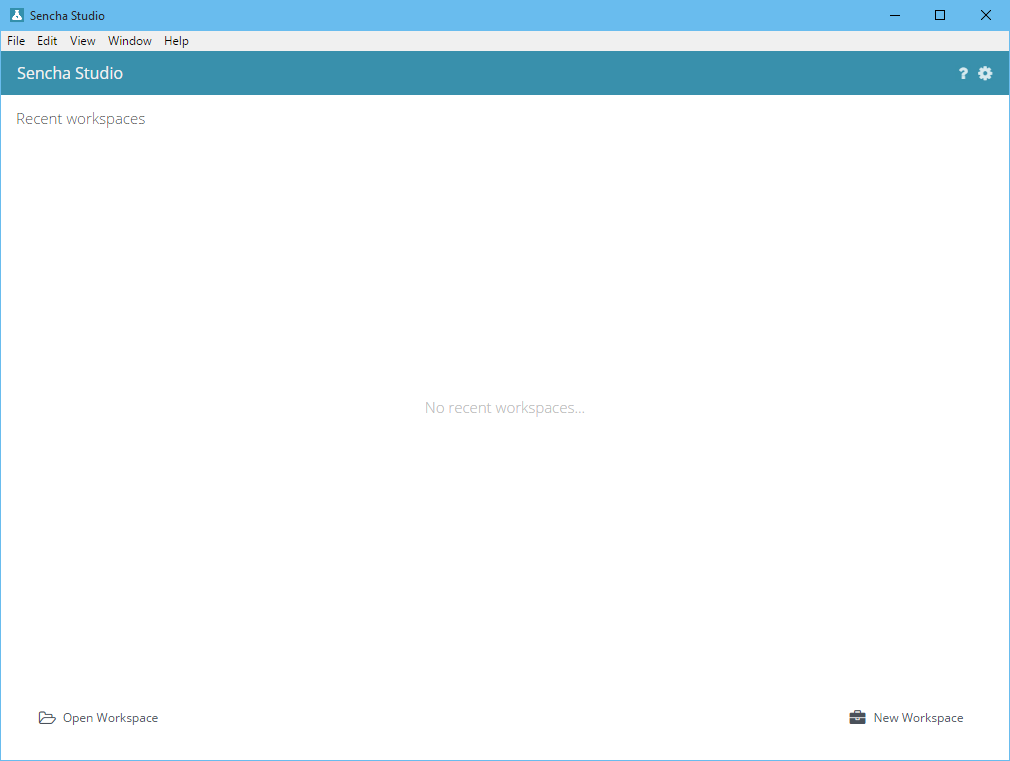
workspace 是最顶层容器,包含测试环境的所有东西. workspace 简单地看就是文件系统中的一个目录,内含一个"workspace.json" 文件. Sencha Test 和 Sencha Cmd (6+) 都能理解这个文件. 此文件描述了应用程序, 包(packages), 主题(themes), Sencha 框架, 和
如今的 测试项目.
首先,你需要打开一个已有的 workspace 或者创建一个新的 workspace. 如果你正在使用 Sencha Cmd, 你可以在 Sencha Test 中直接打开一个 Sencha Cmd workspace 或 独立的应用程序. Sencha Cmd 不是必须的, 所以如果你没在使用它,也不用担心. 不过,如果 Sencha Cmd 已安装, Sencha Studio
就会默认启动 Cmd 集成特性. 这个默认行为可以在偏好设置(Preferences)对话框中禁用. 要注意,
即使禁用此集成,Sencha Test 和 Sencha Cmd 还是会共享同一个
"workspace.json" 文件.
现在, 每一个应用程序, 包, 和 workspace 都可能包含一个测试项目(默认都含有一个 "test/project.json" 文件). 测试项目 管理着 测试套件(suite),这个会在后面的指南中详细介绍.
你可以使用欢迎界面的右下角的 “New Workspace” 按钮创建一个新的 workspace.

创建 (或打开) 一个 workspace 后, 下次启动 Sencha Studio 时,它会显示在欢迎界面上.
如果你已经有了一个 workspace, 比如你从源码库中克隆下来的, 这时你要点击 “Open Workspace” 按钮,然后选择已有 workspace 的目录.

Sencha Studio 可以和 Sencha Cmd 生成的 workspaces 无缝集成, workspaces 包含 应用程序, 主题, 或 包. 只要简单地点击 “Open Workspace” 即可打开这些 workspaces.
打开一个 workspace 之后, Sencha Studio 会在左侧项目导航树上展示它的内容. 为了说明, 我们打开一个 GitHub 上的示例项目 的 "Workspace" 目录,并展开这2个应用程序节点.
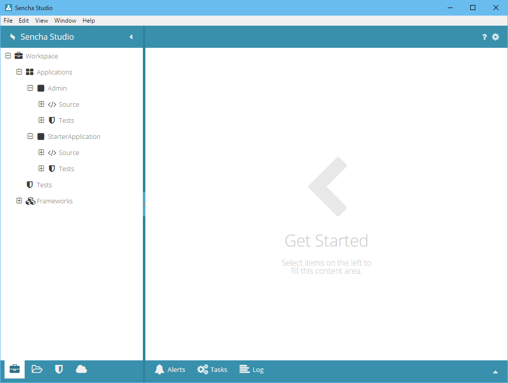
因为这个项目是一个 Sencha Cmd workspace, 除了测试项目之外,还可能有多个应用程序(此处有2个). 每个应用程序又拥有自己的测试项目,可通过 Tests 节点展开:

workspace 自身也可以包含一个测试项目, 但是此处它没有被初始化过,所以是一个不可展开的 Tests 节点.

要创建和配置测试项目, 请看 项目(Projects), 场景(Scenarios) 和 套件(Suites) guide.
项目树展示了 workspace 逻辑结构的内容. 你也可以切换到 Files 标签页,查看实际文件和文件夹.
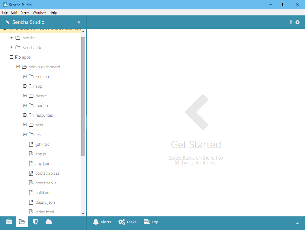
在树中选择一个文本文件,会在 Sencha Studio 的源码编辑器中打开此文件. 选择一个未知类型的文件则什么效果都没有.
要审查 workspace 相关的测试执行的结果, 需要切换到 Runs 标签页.
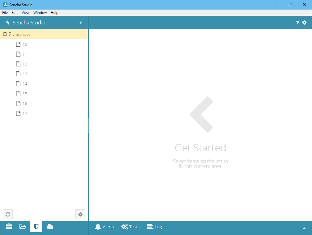
这个标签页中列出来的测试执行,是从 Sencha Test 归档服务器中获取过来的. 选择一个执行,才会下载它的结果,然后展示在内容区域.
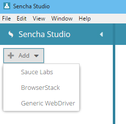
要管理浏览器农场(browser farms) (为 WebDriver 集中存取信息), 请切换到 Browsers 标签页.
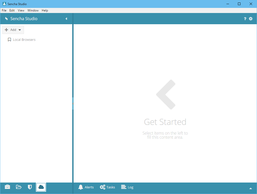
在这个标签页中, 你可以添加新的浏览器农场定义. 这些定义可以用于 Sencha Studio 测试运行器,也可以用于stc 命令行.
打开一个 workspace 后,如果要回到欢迎界面, 点击以下菜单:
File / Sencha Studio        (Windows and Linux / Mac)
    Close Workspace
你也可能想要打开最近打开过的 workspaces,可以点击下面的菜单:
File / Sencha Studio
    Reopen Workspace
        [recently opened workspaces]
你可以在任何界面下,点击一下菜单,打开一个 workspace:
File / Sencha Studio
    Open Workspace
你也可以创建一个 workspace:
File / Sencha Studio
    New
        Workspace...
如果你安装了 Sencha Cmd,并且启动了与 Sencha Studio 的集成, 你也可以使用 Sencha Studio 的 "New" 菜单,新增一个应用程序, 包, 或者 主题.
File / Sencha Studio
    New
        Application...
        Package...
        Theme...
Sencha Studio 有许多配置选项. 可以点击右上的 "齿轮" 图标进入.

想要获得帮助, 请点击 "?" 图标,就会在默认浏览器中打开 Sencha Test 文档页面了.
除了 Sencha Studio 的主要功能之外, 还有3个标签页,提供了访问 Sencha Studio 内部某些方面的入口.
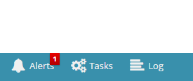
Alerts 标签页包含了可能需要你注意的重要消息和项目. Alerts 不同于 log 消息,因为它们通常要求处理或者是重要通知. 如果你不再需要这些消息,可以丢弃它们. Tasks 标签页显示了 Sencha Studio 正在进行的后台任务.
Log 标签页会显示和过滤来自不同地方(比如 后台任务)的日志消息. 日志消息可以拷贝到剪贴板,以便找出问题所在.
通过初始的 workspace 配置, 现在你可以继续创建你的第一个测试项目套件了. 请查阅 项目, 场景(Scenarios)和套件(Suites) 指南,以获得如何设置测试的组织结构的说明. 阅读 stc 使用指南,以便了解如何使用 stc 在命令行界面上运行你的测试.
如果你有更多问题, 或者 bug 报告, 请访问 Sencha Test 论坛.